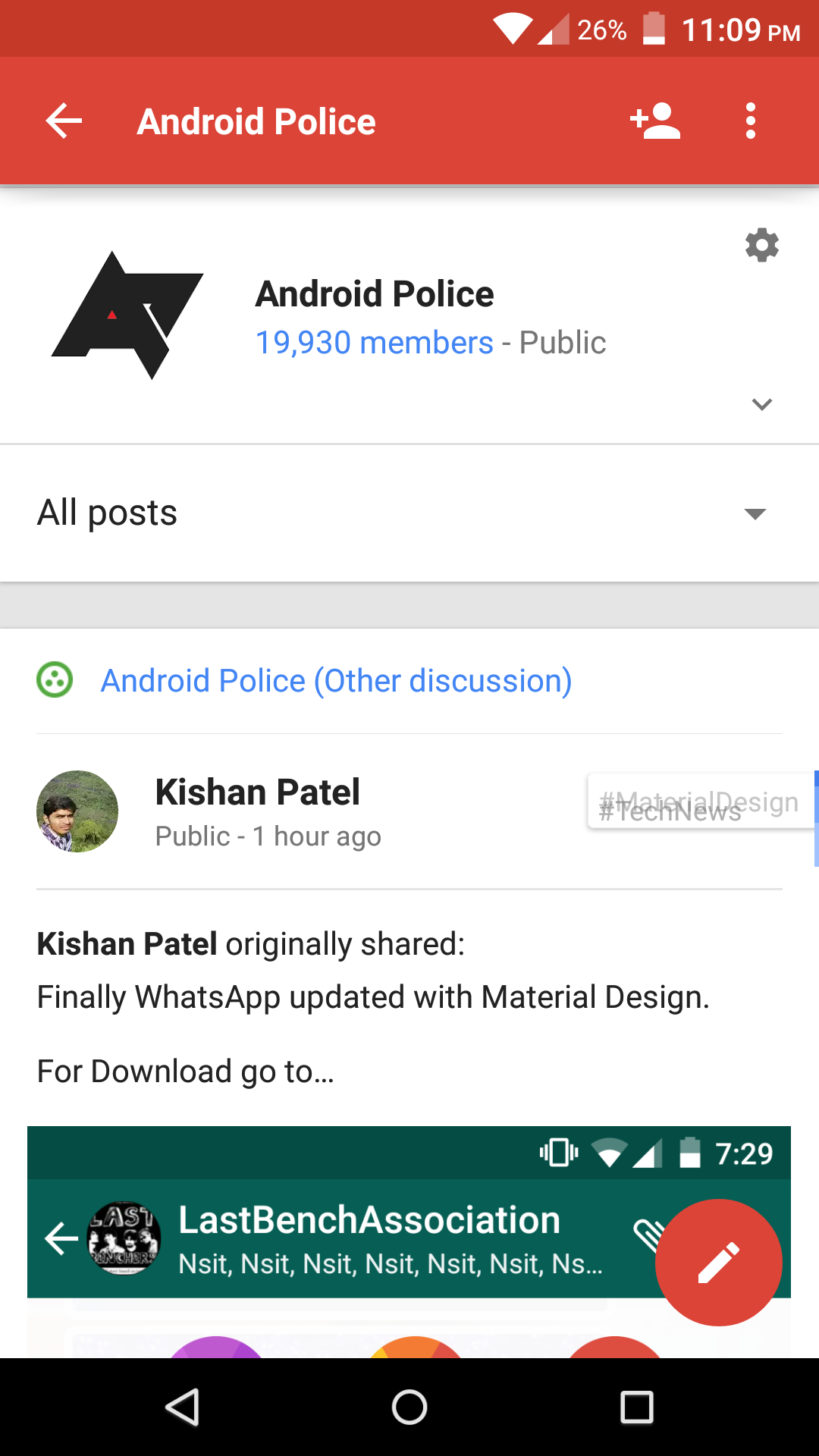
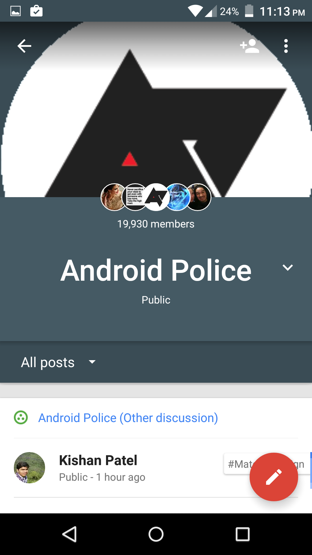
The latest update for Google+ brings changes you probably won't notice unless you head to a community, in which case you will really notice. The main focus of the v5.3 version is a revamped UI for communities, which certainly makes things really pop. Here's a quick before-and-after look:


Left: v5.2 Right: v5.3
Now, an individual community has its own distinct look that makes it clear that you're not browsing through your main Google+ stream. While the big picture and prominent title text are the more obvious features, I found the changed color in the status bar to be especially helpful, since it is the only remaining UI element that keeps you aware of where you are once you begin scrolling downward.

The changes are almost completely superficial; that is, I don't see any changed functionality. And until communities can upload higher-resolution images, that blown-up one you see when first visiting will look pretty pixelated as it is in my example images.
In case you didn't realize it by now, this update includes no user-facing changes to Photos, so you will have to keep waiting for that to be unbundled.
There is a new material refresh animation as well.
Thanks to Dominic Powell and many others after him for the tip. The v5.3 update also includes the material refresh animation when you pull down, as you'll see in the images below. Previously, it was using the multi-colored line we saw back in KitKat. From our testing and some other reports, not everyone using v5.3 is seeing the new animation, suggesting it is a server side change. Still, it appears you must have v5.3 for the switch to take effect.
Good content ANIMATION SERVICES in USA
ReplyDelete